UI Widgets
Android provides multiple types of UI controls that can be used for the creation of UI. This includes controls such as text fields, buttons, checkboxes, seek bars, toggle buttons, etc.
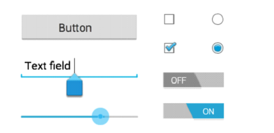
- TextView: This a common UI control that is used for displaying the text.
- EditText: This is a subclass of the TextView Control which is used for adding editing capabilities.
- AutoComplete_TextView: It has got same capabilities as EditText, along with that it shows the suggestions for completions automatically. So, when the user types, he gets these autocomplete suggestions.
- Button: This is a push-button, which can be pressed as well as clicked, upon a user-initiated action.
- Image Button: This is the button with a specific image, that can be clicked. With the help of this button, a developer can specifically place the image.
- CheckBox: This provides an option to enable or disable a particular. On a UI users have certain options that are not considered mutually exclusive, this is where CheckBox is the best option.
- ToggleButton: ToggleButton allows to turn on or turn off a particular option on the UI.
- RadioButton It can have only two assigned states, that is on or off.
- Spinner: This is a drop-down list from where the user can select an option.
- ProgressBar: This control shows the progress of a particular item or activity visually. A good example will be tasks in the background.
- TimePicker: This allows the user to select a time in AM/PM format or 24-Hour format.
- DatePicker: This allows the users to select a specific date.
All these controls are used by developers while creating the UI. The UI designer considers functional requirements before selecting the UI controls for the widget. We will discuss some of these controls in detail in the later section.