Form Layout
In Bootstrap, you can create the following types of form layouts:
- Vertical (default) form
- In-line form
- Horizontal form
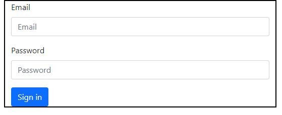
Vertical or Basic Form
Bootstrap provides the fundamental form structure, and individual form controls are automatically styled globally. To make a simple form, follow these steps:
- To the parent form> element, add a role form.
- Use the class.form-group to wrap labels and controls in a div. This is required for proper spacing.
- Give all textual.input>,.textarea>, and.select> components the.form-control class.
<form>
<div class="container">
<div class="col-md-6">
<div class="mb-3">
<label class="form-label" for="inputEmail">Email</label>
<input type="Email" class="form-control" id="inputId" placeholder="Email">
</div>
<div class="mb-3">
<label class="form-label" for="inputPassword">Password</label>
<input type="password" class="form-control" id="inputPassword" placeholder="Password">
</div>
<button type="submit" class="btn btn-primary">Sign in</button>
</div>
</div>
</form>
OUTPUT :
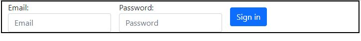
Inline Form
Add the class.form-inline to the form> tag to make a form with all components inline, left aligned, and labels beside.
- In Bootstrap, inputs, selections, and textareas have a default width of 100%. When utilising an inline form, you must specify a width for the form controls.
- You can hide the labels of inline forms by using the class.sr-only.
<form>
<div class="container">
<div class="row align-items-center g-3">
<div class="col-auto">
<label for="inputEmail" >Email:</label>
<input type="email" class="form-control" id="inputEmail" placeholder="Email">
</div>
<div class="col-auto">
<label for="inputPassword">Password:</label>
<input type="password" class="form-control" id="inputPassword" placeholder="Password">
</div>
<div class="col-auto">
<button type="submit" class="btn btn-primary">Sign in</button>
</div>
</div>
</div>
</form>
OUTPUT :
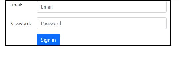
Horizontal Form
Horizontal forms are distinguished from other forms not just by the amount of markup used, but also by the way the form is presented. Follow these steps to make a form with a horizontal layout:
- Give the parent.form> element the.form-horizontal class.
- Use the class.form-group to wrap labels and controls in a div.
- Give the labels the.control-label class.
<form>
<div class="container">
<div class="row mb-3">
<label for="inputEmail"class="col-sm-2 col-form-label">Email:</label>
<div class="col-sm-10">
<input type="email" class="form-control" id="inputEmail" placeholder="Email">
</div>
</div>
<div class="row mb-3">
<label for="inputPassword"class="col-sm-2 col-form-label">Password:</label>
<div class="col-sm-10">
<input type="password" class="form-control" id="inputPassword" placeholder="Password">
</div>
</div>
<div class="row">
<div class="col-sm-10 offset-sm-2">
<button type="submit" class="btn btn-primary">Sign in</button>
</div>
</div>
</div>
</form>
OUTPUT :
Supported Form Controls
The most popular form controls supported by Bootstrap are input, textarea, checkbox, radio, and select.
Inputs
The input field is the most frequent form text field. This is where users will fill out the majority of the form's required information. All native HTML5 input types are supported by Bootstrap, including text, password, datetime, datetime-local, date, month, time, week, number, email, url, search, tel, and colour. To make Inputs properly stylized, proper type declaration is required.
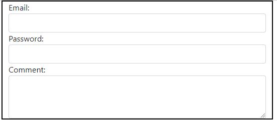
Textarea
When numerous lines of input are required, the textarea is used. As needed, change the rows attribute (fewer rows = smaller box, more rows = larger box).
<div class="container">
<div class="form-group">
<label for="usr">Email:</label>
<input type="text" class="form-control" id="user">
</div>
<div class="form-group">
<label for="pwd">Password:</label>
<input type="password" class="form-control" id="password">
</div>
<div class="form-group">
<label for="comment">Comment:</label>
<textarea class="form-control" rows="3" id="comment"></textarea>
</div>
</div>
OUTPUT :
CheckBoxes and Radio Buttons
When you want users to choose from a list of predefined alternatives, checkboxes and radio buttons are ideal.
- If you want the user to select any number of options from a list, use checkboxes when creating a form. If you only want the user to make one choice, utilise radio.
- To make a sequence of checkboxes or radios for controls look on the same line, use the.checkbox-inline or.radio-inline classes.
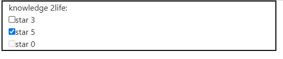
<div class="container">
knowledge 2life:
<div class="checkbox">
<label><input type="checkbox" value="">star 3</label>
</div>
<div class="checkbox">
<label><input type="checkbox" value="">star 5</label>
</div>
<div class="checkbox disabled">
<label><input type="checkbox" value="" disabled>star 0</label>
</div>
</div>
OUTPUT :
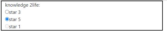
<div class="container">
knowledge 2life:
<div class="radio">
<label><input type="radio" name="optradio" checked>star 3</label>
</div>
<div class="radio">
<label><input type="radio" name="optradio">star 5</label>
</div>
<div class="radio disabled">
<label><input type="radio" name="optradio" disabled>star 1</label>
</div>
</div>
OUTPUT :
Selects
A select is used when you want the user to be able to choose from numerous possibilities, but it only allows one by default.
- For list alternatives that the user is familiar with, such as states or numerals, use choose.
- Use numerous = "multiple" to allow users to choose from a variety of options.
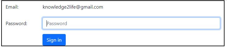
Static Control
Use the class.form-control-static on a p> when you actually require plain text beside a form label inside a horizontal form.
<form>
<div class="container">
<div class="row mb-3">
<label for="inputEmail" class="col-sm-2 col-form-label">Email:</label>
<div class="col-sm-10">
<input type="email" readonly class="form-control-plaintext" id="inputEmail" value="knowledge2life@gmail.com">
</div>
</div>
<div class="row mb-3">
<label for="inputPassword" class="col-sm-2 col-form-label">Password:</label>
<div class="col-sm-10">
<input type="password" class="form-control" id="inputPassword" placeholder="Password">
</div>
</div>
<div class="row">
<div class="col-sm-10 offset-sm-2">
<button type="submit" class="btn btn-primary">Sign in</button>
</div>
</div>
</div>
</form>
OUTPUT :
Form Control States
In addition to the:focus state (when a user clicks or tabs into an input), Bootstrap provides style for disabled inputs and form validation classes.
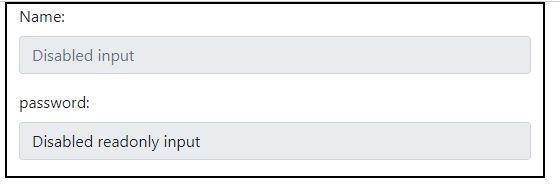
Disabled lnputs
When you use the disabled attribute to deactivate an input, it not only disables it, but it also changes the styling and the mouse pointer when the cursor hovers over it.
<div class="container">
<div class="col-md-6">
<div class="mb-3">
<label class="form-label" for="inputname">Name:</label>
<input class="form-control" type="text" placeholder="Disabled input" aria-label="Disabled input example" disabled>
</div>
<div class="mb-3">
<label class="form-label" for="inputname">password:</label>
<input class="form-control" type="text" value="Disabled readonly input" aria-label="Disabled input example"
disabled readonly>
</div>
</div>
OUTPUT :
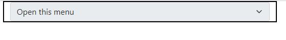
Disabled Fieldsets
To disable all of the controls in a fieldset> at once, add the disabled property to it.
<div class="container">
<select class="form-select" aria-label="Disabled select example" disabled>
<option selected>Open this menu</option>
<option value="1">option 1</option>
<option value="2">option 2</option>
<option value="3">option 3</option>
</div>
OUTPUT :
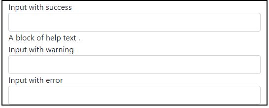
Validation States
Validity style for errors, warnings, and success messages are included in Bootstrap. For using, simply add the relevant class to the parent element (.has-warning,.has-error, or.has-success).
<div class="container">
<div class="form-group has-success">
<label class="control-label" for="inputSuccess1">Input with success</label>
<input type="text" class="form-control" id="inputSuccess1" aria-describedby="helpBlock2">
<span id="helpBlock2" class="help-block">A block of help text .</span>
</div>
<div class="form-group has-warning">
<label class="control-label" for="inputWarning1">Input with warning</label>
<input type="text" class="form-control" id="inputWarning1">
</div>
<div class="form-group has-error">
<label class="control-label" for="inputError1">Input with error</label>
<input type="text" class="form-control" id="inputError1">
</div>
</div>
OUTPUT :
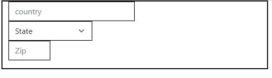
Form Control Sizing
Form heights and widths can be customised using classes like.input-lg and.col-lg-*.
<div class="container">
<div class="row g-3">
<div class="mb-3">
<div class="col-6">
<input type="text" class="form-control" placeholder="country">
</div>
<div class="col-4">
<select class="form-select">
<option>State</option>
</select>
</div>
<div class="col-2">
<input type="text" class="form-control" placeholder="Zip">
</div>
</div>
</div>
</div>
OUTPUT :
Input Focus
The outline of an input is deleted and a box-shadow is applied when it receives:focus.
Help Text
A block level help text that flows with the inputs can be added to Bootstrap form controls. Use the.help-block after the.input> to create a full-width content block.