Button groups and button dropdowns
Button groups and button dropdowns
This chapter will show you how to use Bootstrap classes to add a dropdown menu to buttons. Simply surround the button and the dropdown menu in a.btn-group to add a dropdown to it. span class = "caret">/span> can also be used to indicate that the button is a drop down.
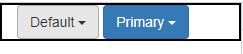
The following example shows a simple single-button dropdown menu.
<div class = "btn-group">
<button type = "button" class = "btn btn-default dropdown-toggle" data-toggle = "dropdown">
Default
<span class = "caret"></span>
</button>
<ul class = "dropdown-menu" role = "menu">
<li><a href = "#">Action</a></li>
<li><a href = "#">Another action</a></li>
<li><a href = "#">Something else here</a></li>
<li class = "divider"></li>
<li><a href = "#">Separated link</a></li>
</ul>
</div>
<div class = "btn-group">
<button type = "button" class = "btn btn-primary dropdown-toggle" data-toggle = "dropdown">
Primary
<span class = "caret"></span>
</button>
<ul class = "dropdown-menu" role = "menu">
<li><a href = "#">Action</a></li>
<li><a href = "#">Another action</a></li>
<li><a href = "#">Something else here</a></li>
<li class = "divider"></li>
<li><a href = "#">Separated link</a></li>
</ul>
</div>
OUTPUT :
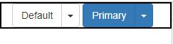
Split button dropdowns use the same general style as the dropdown button but add a primary action along with the dropdown.
Split buttons have the primary action on the left and a toggle on the right that displays the dropdown.
<div class = "btn-group">
<button type = "button" class = "btn btn-default">Default</button>
<button type = "button" class = "btn btn-default dropdown-toggle" data-toggle = "dropdown">
<span class = "caret"></span>
<span class = "sr-only">Toggle Dropdown</span>
</button>
<ul class = "dropdown-menu" role = "menu">
<li><a href = "#">Action</a></li>
<li><a href = "#">Another action</a></li>
<li><a href = "#">Something else here</a></li>
<li class = "divider"></li>
<li><a href = "#">Separated link</a></li>
</ul>
</div>
<div class = "btn-group">
<button type = "button" class = "btn btn-primary">Primary</button>
<button type = "button" class = "btn btn-primary dropdown-toggle" data-toggle = "dropdown">
<span class = "caret"></span>
<span class = "sr-only">Toggle Dropdown</span>
</button>
<ul class = "dropdown-menu" role = "menu">
<li><a href = "#">Action</a></li>
<li><a href = "#">Another action</a></li>
<li><a href = "#">Something else here</a></li>
<li class = "divider"></li>
<li><a href = "#">Separated link</a></li>
</ul>
</div>
OUTPUT :