HTML5 doctype
Certain HTML elements and CSS properties in Bootstrap require the use of the HTML5 doctype.
Mobile First
Since the release of Bootstrap 3, the framework has shifted to a mobile-first approach. It means that instead of being in separate files,'mobile first' styles can be found throughout the entire library. To enable appropriate rendering and touch zooming on mobile devices, add the viewport meta tag to the head> element.
- The device's width is controlled by the width property. Setting it to device-width ensures that it is appropriately rendered on a variety of platforms (mobiles, PCs, tablets, etc.).
- initial-scale = 1.0 guarantees that your web page is rendered at a 1:1 scale when loaded, with no zooming done out of the box.
<div class="contenair">
<div class="row">
<div class="col-12 col-md-4">
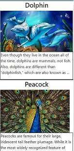
<h1 class="d-flex justify-content-center">Dolphin</h1>
<img src="dol_img.jpeg" class="img-responsive" alt="Dolphine">
<div class="col-12 col-md-8 align-items-center">
<p>Even though they live in the ocean all of the time, dolphins are mammals, not fish.
Also, dolphins are different than "dolphinfish," which are also known as ...</p>
</div>
</div>
</div>
<div class="row">
<div class="col-12 col-md-4">
<h1 class="d-flex justify-content-center">Peacock</h1>
<img src="peacock_img.jpg" class="img-responsive" alt="peacock">
<div class="col-12 col-md-8 align-items-center">
<p>Peacocks are famous for their large, iridescent tail feather plumage.
While it is the most widely recognized feature of peafowls,
only males have these beautiful tail colorings.</p>
</div>
</div>
</div>
</div>
OUTPUT :
Responsive Images
By adding the class.img-responsive to the img> tag in Bootstrap 3, you can make the images responsive. The picture is given the properties max-width: 100 percent; and height: auto; so that it scales well with the parent element.
<div class="codeblock">
<h3>Responsive Image of Knowledge 2life</h3>
<p> change the size of the browser window </p>
<img src="knowledge_ Image.jpeg"
class="img-responsive" alt="Responsive image"
width="240" height="180" />
</div>
OUTPUT :
Typography and Links
Bootstrap establishes a foundational global presentation (background), font, and link design.
- Standard Global Display - sets the body> object's background-color to #fff.
- The typographic base is defined by the @font-family-base, @font-size-base, and @line-height-base properties.
- Link styles: Sets the global link colour using the @link-color attribute and only applies link underlines on:hover.
Normalize
Normalize is used by Bootstrap to provide cross-browser uniformity.
NormalizeCSS resets have been replaced by css, a modern, HTML5-ready alternative. It's a simple CSS file that improves cross-browser uniformity in HTML element default styling.
Containers
To wrap a page's content and simply centre it, use the class.container.
<div class="container" style="background: blue;">
<h1>Knowledge 2life</h1>
<p>Knowledge 2life free web tutorial</p>
</div>
OUTPUT :