Responsive utilities in bootstrap
Responsive utilities in bootstrap
For speedier mobile-friendly development, Bootstrap includes a number of utility classes. These can be coupled with large, small, and medium devices to show and hide content according to device using media query.
Use them wisely and avoid making many versions of the same website. At the moment, responsive utilities are only available for toggling blocks and tables.
| Classes | Devices |
|---|
| .visible-xs | Smaller than usual (less than 768px) visible |
| .visible-sm | Visible in small sizes (up to 768 px) |
| .visible-md | Visible in medium (768 px to 991 px) |
| .visible-lg | Visible in larger sizes (992 px and up). |
| .hidden-xs | Hidden extra small (less than 768px) |
| .hidden-sm | Hidden small (up to 768 px) |
| .hidden-md | hidden (768 px to 991 px) medium |
| .hidden-lg | Hidden (992 px and above) Larger |
Print Classes
The following table lists the print classes. Use these for toggling the content for print.
| Classes | Print |
|---|
| .visible-print | Yes Visible |
| .hidden-print | Visible only to browsers, not to print. |
| 1 | Carmen |
Example
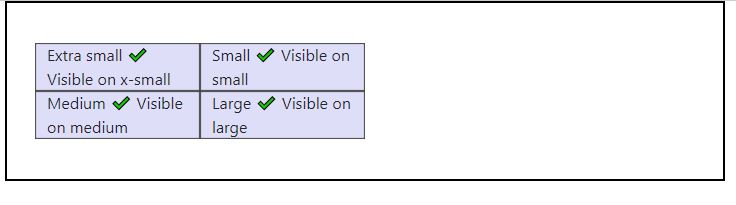
The use of the above-mentioned helper classes is demonstrated in the following example. To test the responsive utility classes, resize your browser or load the sample on multiple devices.
<div class = "container" style = "padding: 40px;">
<div class = "row visible-on">
<div class = "col-xs-6 col-sm-3" style = "background-color: #dedef8;
box-shadow: inset 1px -1px 1px #444, inset -1px 1px 1px #444;">
<span class = "hidden-xs">Extra small</span>
<span class = "visible-xs">✔ Visible on x-small</span>
</div>
<div class = "col-xs-6 col-sm-3" style = "background-color: #dedef8;
box-shadow: inset 1px -1px 1px #444, inset -1px 1px 1px #444;">
<span class = "hidden-sm">Small</span>
<span class = "visible-sm">✔ Visible on small</span>
</div>
<div class = "clearfix visible-xs"></div>
<div class = "col-xs-6 col-sm-3" style = "background-color: #dedef8;
box-shadow: inset 1px -1px 1px #444, inset -1px 1px 1px #444;">
<span class = "hidden-md">Medium</span>
<span class = "visible-md">✔ Visible on medium</span>
</div>
<div class = "col-xs-6 col-sm-3" style = "background-color: #dedef8;
box-shadow: inset 1px -1px 1px #444, inset -1px 1px 1px #444;">
<span class = "hidden-lg">Large</span>
<span class = "visible-lg">✔ Visible on large</span>
</div>
</div>
</div>
OUTPUT :