helper classes in bootstrap
Close icon
To dismiss content like as modals and notifications, use the generic close icon. Use the class close to get the close icon.
Carets
Carets are used to show the functioning and orientation of dropdown menus. Use the class caret with a span> element to gain this capability.
<style media="screen">
h1{
color:blue;
font-weight: bold;
}
</style>
<body class="container">
<h1>This is knowledge 2life!</h1>
<!--Alert-->
<div class="alert alert-success alert-dismissible
fade show w-50" role="alert">
<strong>knowledge!</strong>
<!--Close Icon-->
<button type="button" class="btn close"
data-dismiss="alert" aria-label="Close">
<span aria-hidden="true">×</span>
</button>
</div>
OUTPUT :

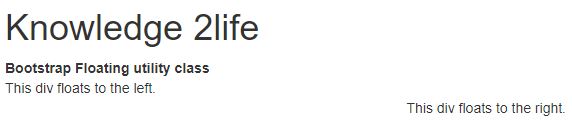
Quick Floats
With the classes pull-left and pull-right, you can float an element to the left or right, accordingly.
Instead of using.navbar-left or.navbar-right, use.navbar-left or.navbar-right to align components in navbars with utility classes. For more information, see the navbar chapter.
<div class="container">
<h1 >Knowledge 2life</h1>
<b>Bootstrap Floating utility class</b>
<br>
<div class="pull-left">
This div floats to the left.
</div>
<br>
<div class="pull-right">
This div floats to the right.
</div>
<br>
</div>
OUTPUT :
Center Content Blocks
To centre an element, use the class center-block.
<div class="bs-example">
<div class="container">
<div class="row">
<div class="col-lg-12 bg-light text-center">
<h1>knowledge 2life</h1>
<h2> Centered Content in Bootstrap. </h2>
<img src=dol_img.jpeg alt="know" height="200px">
</div>
</div>
</div>
</div>
OUTPUT :

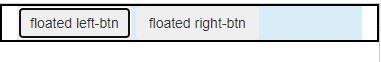
Clearfix
To clear the float of any element, use the.clearfix class.
<div class="container">
<div class="bg-info clearfix">
<button type="button" class="btn btn-secondary left">
floated left-btn
</button>
<button type="button" class="btn btn-secondary right">
floated right-btn
</button>
</div>
OUTPUT :
Content Displaying and Hiding
The classes.show and.hidden can be used to cause an element to be visible or hidden (even for screen readers).
<h1 > knowledge 2life</h1>
<p id="GFG_UP"></p>
<div id="div">
This is Div box.
</div>
<br>
<button onClick="GFG_Fun()">
click here
</button>
<br>
<p id="GFG_DOWN" style="color: blue;"></p>
<script>
$('#GFG_UP').text( "Click on button ");
function show(divId) {
$("#" + divId).show();
}
function GFG_Fun() {
show('div');
$('#GFG_DOWN').text("DIV Box is visible.");
}
</script>
OUTPUT :

Content for Screen Readers
With the class.sr-only, you can hide an element from all devices except screen readers.
<h1 class="sr-only">knowledge 2life</h1>
OUTPUT :
