2D transforms
CSS allows us to modify or transform the elements. There are two types of transformation in CSS. In this article, we are going to read about 2D Transformation and its methods.
In 2D Transformation, we can perform a various transformation of the element, like, rotate, translate, move, skew etc.
Particular browsers can support transform attribute of CSS:-
- Chrome (36.0)
- Internet Explorer (10.0)
- Mozilla Firefox (16.0)
- Opera Mini (23.0)
- Safari (9.0)
The brackets indicate the minimum version of the browser, which can support the transform attribute of the CSS.
The property which we can use in the 2D Transformation methods:-
- rotate() : used to rotate the element
- translateX(n):used when the element needs to be transformed along the x-axis
- translateY(n) : used when the element needs to be transformed along the y-axis
- translate(x,y) : used when the element needs to be transformed along the x-axis as well as the y-axis
- skewX() : used to perform skew transforms along x-axis
- skewY() : used to perform skew transforms along the y-axis
- matrix() : used to perform matrix transforms
- scaleX(n) : used when the width of the element needs to be changed
- scaleY(n) : used when the height of the element needs to be changed
- scale(x,y) : used when the width and height of the element needs to be changed
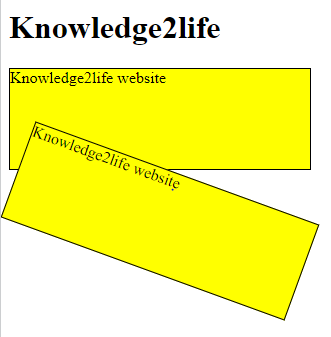
Example:
<html>
<html lang="en-US">
<style>
div {
width: 300px;
height: 100px;
background-color: yellow;
border: 1px solid black;
}
div#myDiv {
-ms-transform: rotate(20deg);
transform: rotate(20deg);
}
</style>
</head>
<body>
<h1>Knowledge2life</h1>
<div>
Knowledge2life website
</div>
<div id="myDiv">
Knowledge2life website
</div>
</body>
</html>
OUTPUT: