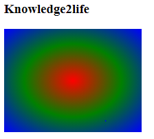
Smooth transitions between two or more colors can be generated using CSS radial-gradient() inbuilt function.
background-image: radial-gradient(shape size at position, start-color, ..., last-color);
Meaning of the arguments:
position: used to specify the gradient position such as the bottom, right, etc. The default value is center.
shape: used to specify the gradient shape. It can have circular or elliptical shapes. It takes elliptical value if not specified.
size: used to specify the gradient size. It can take four values: farthest-corner, farthest-side, closest-corner, and closest-side. The default value is farthest-corner.
start-color,….,last-color: used to hold the color values.
|
|