Responsive
When a webpage is viewed on different devices, it can look different on each device. Sometimes the content may be missed due to the change in the size of the device. To make a webpage appear the same on all devices we can use responsive web designing. HTML and CSS are used for designing.
Viewport: The user’s visible area on a webpage is known as the viewport. < meta> tag introduced in HTML5 can be used to make a webpage responsive. The selector is the element that needs to be styled. We can have multiple properties and values according to your requirements.
Syntax:
< meta name="viewport" content="width=device-width, initial-scale=1.0">
GridView: To make the process of placing elements easier we can use grid view. The page is divided into 12 columns while using grid view.
Media Query: It is a CSS technique that was introduced in CSS3. @media is used to include CSS properties block only when a condition is true. It can also be used to hide certain elements on different devices.
Example:
<!DOCTYPE html>
<html>
<html lang="en-US">
<meta name="viewport" content="width=device-width, initial-scale=1.0, maximum-scale=1.0, user-scalable=no, height=device-height" />
<style>
/* For width smaller than 400px: */
body {
background-repeat: no-repeat;
background-image: url('sky.jpg');
}
/* For width 400px and larger: */
@media only screen and (min-width: 600px) {
body {
background-image: url('tree.jpg');
}
}
</style>
</head>
<body>
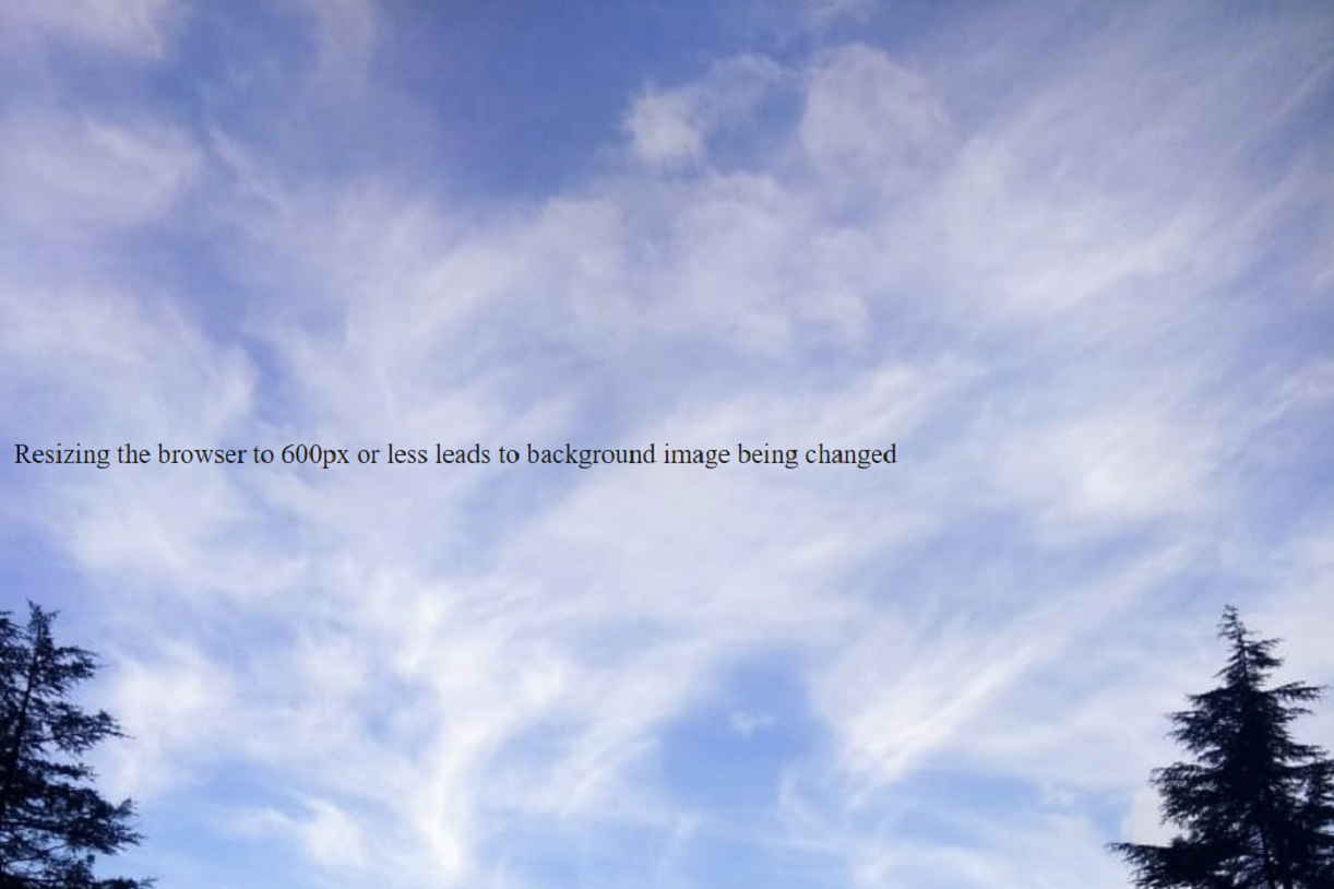
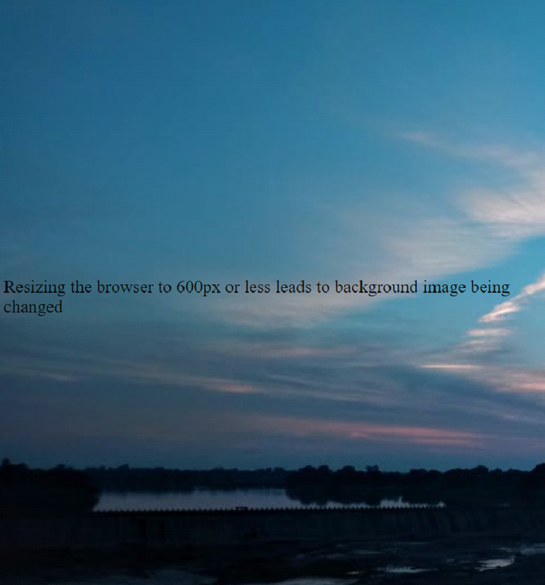
<p style="margin-top:260px;">Resizing the browser to 600px or less leads to background image being changed</p>
</body>
</html>
OUTPUT
Full screen:
When minimized: