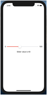
Customising the Slider:
Add some accent colour to the slider
Code:
struct ContentView: View {
@State var Value: Double = 0
var body: some View {
VStack {
HStack{
Text("0")
Slider(value: $Value, in: 0...100, step:10)
.accentColor(.red)
Text("100")
}
}.padding()
Text ("Slider value is \(Int(Value))")
}
}
Output:
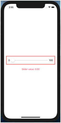
To add a border around the slider that has a specified thickness and colour
Code:
var body: some View {
VStack {
HStack{
Text("0")
Slider(value: $Value, in: 0...100, step:10)
.accentColor(.red)
Text("100")
}.padding()
.border(Color.red, width: 3)
}.padding()
Text("Slider value: \(Value, specifier: "%.2f")")
.foregroundColor(.pink)
}
}
Output:
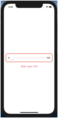
c. To add a rounded border around the slider that has a specified thickness and colour use overlays instead of a .border(_content:)
Code:
VStack {
HStack{
Text("0")
Slider(value: $Value, in: 0...100, step:10)
.accentColor(.red)
Text("100")
}.padding()
.overlay(
RoundedRectangle(cornerRadius: 12.0)
.stroke(lineWidth: 3.0)
.foregroundColor(Color.red))
}.padding()
Text("Slider value: \(Value, specifier: "%.2f")")
.foregroundColor(.pink)
Output: