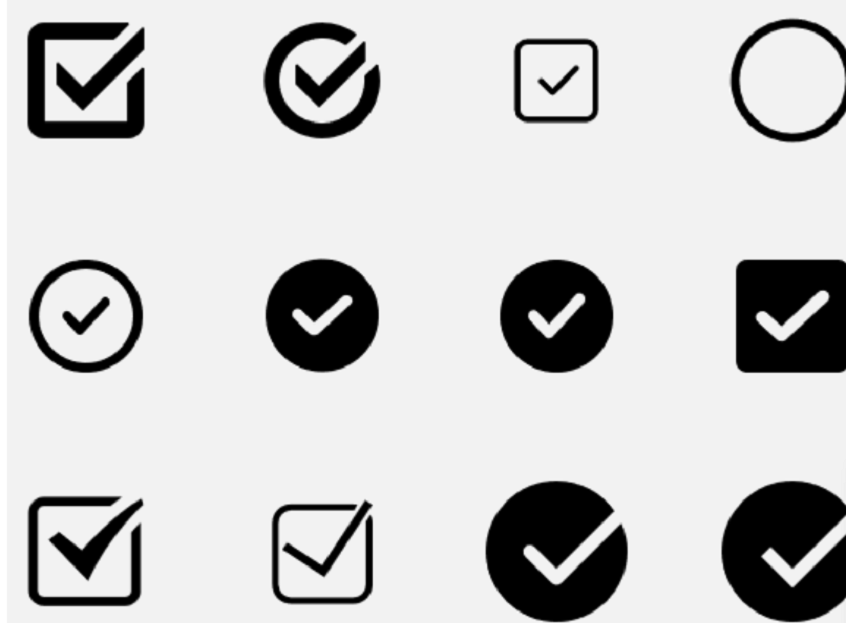
The checkbox is one of the UI controls in Android, but the best part is it can be customized as per the requirements. Often standard UI controls might not meet the functional requirements, and that is why custom UI control might be required. For example, there might be a requirement for a square checkbox or a round checkbox, or a start checkbox. Sometimes we also want a checkbox in the form of a logo. There might be multiple requirements for the custom checkboxes.
There are multiple sites from where we can get the custom logo for the custom checkboxes as shown in the above image. The first step will be to obtain these images from the custom logo sites, and then use Android Asset Studio for developing drawables in different design sizes, something like hdpi or mdpi. Once a drawable is developed we can include them in our project, which is there in Android Studio. Once the drawables are available, it is time to develop the UI XML Interface that will have the checkbox. In the next step, go to your drawable resource location, and there create a custom XML file, with the code given below.
Once you execute this code, you will have your round custom checkbox. This can be further developed with some animations, that will show a checked and unchecked state.
|
|