Alerts and progress bar
This chapter will cover notifications and the alert classes provided by Bootstrap. Alerts allow you to customise the way you send notifications to your users. They send contextual feedback messages in response to common user behaviours.
To notify, you may add an optional close icon. Use the Alerts jQuery plugin for inline dismissal.
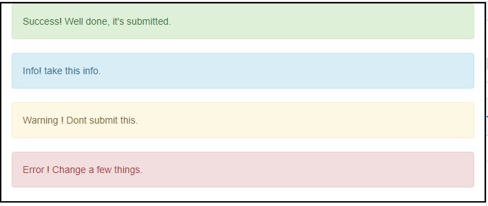
Create a wrapper div> and add a class of.alert and one of the four contextual classes to create a simple alert (e.g., .alert-success, .alert-info, .alert-warning, .alert-danger). This is demonstrated in the following example.
<div class="container">
<div class = "alert alert-success">Success! Well done, it's submitted.</div>
<div class = "alert alert-info">Info! take this info.</div>
<div class = "alert alert-warning">Warning ! Dont submit this.</div>
<div class = "alert alert-danger">Error ! Change a few things.</div>
</div>
OUTPUT :
Dismissal Alerts
To create a dismissing alert, create a wrapper div> and add a class of.alert as well as one of the four contextual classes (e.g., .alert-success, .alert-info, .alert-warning, .alert-danger)
To the above div> class, add the optional.alert-dismissable class.
Add a button to close the window.
This is demonstrated in the following example:
<div class="container">
<div class = "alert alert-success alert-dismissable">
<button type = "button" class = "close" data-dismiss = "alert" aria-hidden = "true">
&times;
</button>
Success! Well done it's submitted.
</div>
<div class = "alert alert-info alert-dismissable">
<button type = "button" class = "close" data-dismiss = "alert" aria-hidden = "true">
&times;
</button>
Info! take this info.
</div>
<div class = "alert alert-warning alert-dismissable">
<button type = "button" class = "close" data-dismiss = "alert" aria-hidden = "true">
&times;
</button>
Warning ! Don't submit this.
</div>
<div class = "alert alert-danger alert-dismissable">
<button type = "button" class = "close" data-dismiss = "alert" aria-hidden = "true">
&times;
</button>
Error ! Change a few things.
</div>
</div>
OUTPUT :

Progress bar
- The progress bars in Bootstrap are covered in this chapter. Progress bars are used to signal that assets are loading, that work is being done on them, or that something is happening with the items on the page.
- Some of the effects of progress bars are achieved using CSS3 transitions and animations. Internet Explorer 9 and earlier versions of Firefox do not support these functionalities. Animations are not supported in Opera 12.
Animations are not supported in Opera 12.
- Progress Bar by default
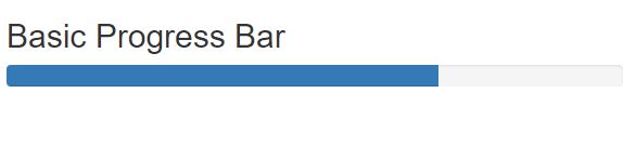
- Add a with the class.progress to make a rudimentary progress bar.
-
Add an empty div> with the class.progress-bar within the above div>.
Create a style attribute for the width, which should be given as a percentage. For instance, style = "60 percent" shows that the progress bar was at 60%.
Consider the following example:
<div class="container">
<h2>Basic Progress Bar</h2>
<div class="progress">
<div class="progress-bar" role="progressbar" aria-valuenow="60" aria-valuemin="0" aria-valuemax="100" style="width:60%">
<span class="sr-only">60% Complete</span>
</div>
</div>
</div>
OUTPUT :
A Different Progress Bar
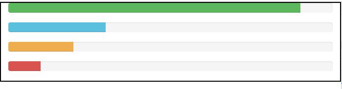
Add a div> with the class.progress to make a progress bar with several styles.
Add an empty div> within the above div> with the class.progress-bar and the class progress-bar-*, where * might indicate success, info, caution, or danger.
Create a style attribute for the width, which should be given as a percentage. For instance, style = "60 percent" shows that the progress bar was at 60%.
Consider the following example:
<div class="container">
<div class = "progress">
<div class = "progress-bar progress-bar-success" role = "progressbar"
aria-valuenow = "60" aria-valuemin = "0" aria-valuemax = "100" style = "width: 90%;">
<span class = "sr-only">90% Complete (Sucess)</span>
</div>
</div>
<div class = "progress">
<div class = "progress-bar progress-bar-info" role = "progressbar"
aria-valuenow = "60" aria-valuemin = "0" aria-valuemax = "100" style = "width: 30%;">
<span class = "sr-only">30% Complete (info)</span>
</div>
</div>
<div class = "progress">
<div class = "progress-bar progress-bar-warning" role = "progressbar"
aria-valuenow = "60" aria-valuemin = "0" aria-valuemax = "100" style = "width: 20%;">
<span class = "sr-only">20%Complete (warning)</span>
</div>
</div>
<div class = "progress">
<div class = "progress-bar progress-bar-danger" role = "progressbar"
aria-valuenow = "60" aria-valuemin = "0" aria-valuemax = "100" style = "width: 10%;">
<span class = "sr-only">10% Complete (danger)</span>
</div>
</div>
</div>
OUTPUT :