Working of Bootstrap Grid System
Working of Bootstrap Grid System
Grid systems are used to create page layouts by arranging your information in a sequence of rows and columns. The Bootstrap grid system operates as follows:
- For appropriate alignment and padding, rows must be placed within a.container class.
- Create horizontal groups of columns by using rows.
- Only columns may be the direct children of rows, and content should be placed within the columns.
- For fast creating grid layouts, predefined grid classes such as.row and.col-xs-4 are available. For more semantic layouts, LESS mixins might be used.
- Padding in columns creates gutters (gaps between column content). Negative margin on.rows is used to offset the padding in rows for the first and last columns.
- Grid columns are generated by defining the amount of available columns you want to span out of a total of twelve. Three equal columns, for example, would require three. col-xs-4.
Media Queries
The word "media query" is a sophisticated way of saying "conditional CSS rule." It simply adds CSS to a page based on a set of circumstances. The style is applied if certain conditions are met.
You may move, show, and hide content based on the viewport size with Bootstrap's Media Queries. A device specification and a size rule are the two pieces of a media query.
<!DOCTYPE html>
<html lang="en">
<head>
<meta charset = "UTF-8">
<title> Media Queries </title>
<style>
body {
background-color:#87ceeb;
color: black;
}
@media screen and (max-width: 900px) {
body {
background-color:#87ceeb;
color: black;
}
}
@media screen and (max-width: 600px) {
body {
background-color: pink;
color: black;
}
}
</style>
</head>
<body>
<h1>KNOWLEDGE 2LIFE</h1>
<h4> Media Queries</h4>
<P>The word "media query" is a sophisticated way of saying
"conditional CSS rule".</P>
<h2>Resize the browser window !</h2>
<p>By default, the background color of
"SKY BLUE".</p>
<p> 600px or less,
it will change</p>
</body>
</html>
OUTPUT :-1

OUTPUT :-2

Responsive column resets
With the four levels of grids available, you're bound to run into situations where the columns don't clear properly at particular breakpoints because one is taller than the other. Use a combination of a class to fix this. clearfix and the responsive utility classes are two examples of this.
<div class="container">
<div class="row">
<div class="col-4">Knowledge 2life col-1</div>
<div class="col-4">Knowledge 2life col-2</div>
<div class="col-4">Knowledge 2life col-3</div>
</div>
<div class="row">
<div class="col-7">Knowledge 2life col-7</div>
<div class="col-5">Knowledge 2life col-5</div>
</div>
</div>
OUTPUT :

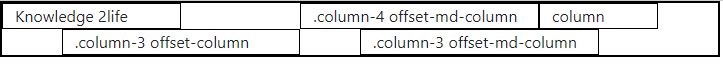
Offset Columns
For more specific layouts, offsets are a handy feature. They can be used to push columns over for more space, or they can be used to push columns over for more space (for example). Offsets are not supported by the.col-xs = * classes, but they can be easily duplicated by using an empty cell.
Employ the.col-md-offset-* classes to use offsets on large displays. These classes extend a column's left margin by * columns, where * is a number between 1 and 11.
<div class="container">
<div class="row">
<div class="col-3">Knowledge 2life</div>
<div class="col-4 offset-md-2">.column-4 offset-md-column</div>
<div class="col-2 ">column </div>
</div>
<div class="row">
<div class="col-4 offset-md-1">.column-3 offset-column</div>
<div class="col-4 offset-md-1">.column-3 offset-md-column</div>
</div>
</div>
OUTPUT :
Nesting columns
Add a new to nest your content with the default grid. Within an existing.col-md-* column, there is a row and a set of.col-md-* columns. A group of columns that adds up to 12 should be included in nested rows.
<div class="container">
<div class="row">
<div class="col-sm-3">
Level 1: .col-sm-3
</div>
<div class="col-sm-9">
<div class="row">
<div class="col-8 col-sm-6">
Level 2: .col-8 .col-sm-6
</div>
<div class="col-4 col-sm-6">
Level 2: .col-4 .col-sm-6
</div>
</div>
</div>
</div>
</div>
OUTPUT :

Column Ordering
Another useful aspect of the Bootstrap grid system is the ability to write columns in one order and display them in another. With the.col-md-push-* and.col-md-pull-* modifier classes, you may simply adjust the order of built-in grid columns, with * ranging from 1 to 11.
<div class="container">
<div class="row">
<div class="col-3 order-last">
1st, but last
</div>
<div class="col-3">
2nd, but unordered
</div>
<div class="col-3 order-first">
3rd, but first
</div>
<div class="col-3 ">
4th, but unordered
</div>
</div>
</div>
OUTPUT :
