Bootstrap Media objects such as photos or videos can be linked to the left or right of other content in a simple and effective way.
Bootstrap Media Objects objects are used when some data is placed next to content to create complex and repetitive content objects.
Categories of available media are:
.media
.media-body
Bootstrap space is used for controlled wrap and width.
Left and Right Alignment
The "left-media" category is used to align the left media object.
The “media-right” section is used to better align the media object.
The "media-body" category is used for content placement.
Syntax:
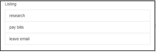
Groups list is used to display a series of content. We may modify it as support for any content according to our needs. The use of List-Groups only indicates a series or list of content in an orderly manner.
Below is the Basic List Group created using a list that is not included in HTML, with the appropriate Bootstrap categories:
|
|