Breadcrumb and Pagination
Breadcrumb and Pagination
Breadcrumbs are a wonderful way to display a site's hierarchy-based information. Breadcrumbs can show the dates of publication, categories, and tags in the case of blogs. They show where the current page is in the navigational hierarchy.
In Bootstrap, a breadcrumb is essentially an unordered list with the class.breadcrumb. CSS (bootstrap.min.css) adds the divider automatically using the following class.
.breadcrumb > li + li:before {
color: #CCCCCC;
content: "/ ";
padding: 0 5px;
}
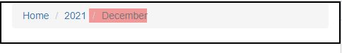
Breadcrumbs are demonstrated in the following example.
<div class="container">
<ol class = "breadcrumb">
<li><a href = "#">Home</a></li>
<li><a href = "#">2021</a></li>
<li class = "active">December</li>
</ol>
</div>
OUTPUT :
Pagination
The following table lists the classes that Bootstrap provides to handle pagination.
| Class | Description | Sample code |
|---|
| .pagination | Add this class to get the pagination on your page |
<ul class = "pagination">
<li><a href = "#">&laquo;
</a></li>
<li><a href = "#">1
</a></li>
.......
</ul>
|
.disabled,
.active | You can customize links by using .disabled for unclickable links and .active to indicate the current page |
<ul class = "pagination">
<li class = "disabled"><a href = "#">&laquo;</a></li>
<li class = "active"><a href = "#">1<span class = "sr-only">
(current)</span></a></li>
.......
</ul>
|
| .pagination-lg, .pagination-sm | Use these classes to get different size items. |
.pagination-lg, .pagination-sm Use these classes to get different size items. <ul class = "pagination pagination-lg">...</ul>
<ul class = "pagination">...</ul>
<ul class = "pagination pagination-sm">...</ul>
</td>
|
<div class="container">
<ul class = "pagination">
<li><a href = "#">&laquo;</a></li>
<li><a href = "#">1</a></li>
<li><a href = "#">2</a></li>
<li><a href = "#">3</a></li>
<li><a href = "#">4</a></li>
<li><a href = "#">&raquo;</a></li>
</ul>
</div>
OUTPUT :