For creating tables, Bootstrap provides a tidy layout. The following are some of the table components that Bootstrap supports:
| Sr.No. | Tag & Description |
|---|
| 1 | < table >
Data in a tabular format is shown using this wrapper element. |
| 2 | < thead >
To label table columns, a container element for table header rows (tr>) is used. |
| 3 | < tbody >
In the table's body, there is a container element for table rows (tr>). |
| 4 | < tr >
On a single row, a container element for a set of table cells (td> or th>). |
| 5 | < td >
Default table cell. |
| 6 | < th >
Labels for columns (or rows, depending on scope and location) are stored in a special table cell. It has to be used within a < thead > tag. |
| 7 | < caption >
A description or summary of the contents of the table. |
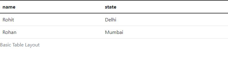
Basic Table
Add the base class of.table to any table for a lovely, basic table style with just some light padding and horizontal dividers.
<table class = "table">
<caption>Basic Table Layout</caption>
<thead>
<tr>
<th>name</th>
<th>state</th>
</tr>
</thead>
<tbody>
<tr>
<td>Rohit</td>
<td>Delhi</td>
</tr>
<tr>
<td>Rohan</td>
<td>Mumbai</td>
</tr>
</tbody>
</table>
OUTPUT :
Optional Table Classes
There are a couple extra classes you may use to style the HTML in addition to the fundamental table markup and the.table class. The sections that follow will provide you an overview of all of these classes.
Striped Table
You may get stripes on rows within the tbody> by adding the.table-striped class.
<table class="table table-striped">
<caption>Striped Table Layout</caption>
<thead>
<tr>
<th>Name</th>
<th>country</th>
<th>state</th>
</tr>
</thead>
<tbody>
<tr>
<td>Rohit</td>
<td>India</td>
<td>Delhi</td>
</tr>
<tr>
<td>Mohit</td>
<td>Sri_lanka</td>
<td>Ampara</td>
</tr>
<tr>
<td>Rohan</td>
<td>India</td>
<td>Kolkata</td>
</tr>
</tbody>
</table>
OUTPUT :

Bordered Table
You may achieve borders around every element and rounded edges all around the table by using the.table-bordered class.
<table class = "table table-bordered">
<caption>Bordered Table Layout</caption>
<thead>
<tr>
<th>Name</th>
<th>country</th>
<th>state</th>
</tr>
</thead>
<tbody>
<tr>
<td>Rohit</td>
<td>India</td>
<td>Delhi</td>
</tr>
<tr>
<td>Mohit</td>
<td>Sri_lanka</td>
<td>Ampara</td>
</tr>
<tr>
<td>Rohan</td>
<td>India</td>
<td>Kolkata</td>
</tr>
</tbody>
</table>
OUTPUT :

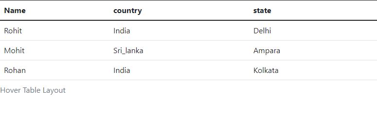
Hover Table
When the pointer hovers over rows, the.table-hover class is applied, giving them a light grey backdrop.
<table class = "table table-hover">
<caption>Hover Table Layout</caption>
<thead>
<tr>
<th>Name</th>
<th>country</th>
<th>state</th>
</tr>
</thead>
<tbody>
<tr>
<td>Rohit</td>
<td>India</td>
<td>Delhi</td>
</tr>
<tr>
<td>Mohit</td>
<td>Sri_lanka</td>
<td>Ampara</td>
</tr>
<tr>
<td>Rohan</td>
<td>India</td>
<td>Kolkata</td>
</tr>
</tbody>
</table>
OUTPUT :
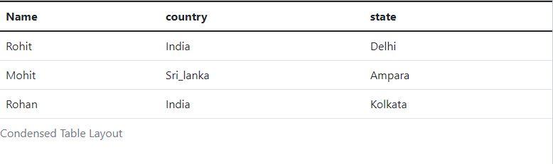
Condensed Table
The.table-condensed class reduces row padding by half, resulting in a more compact table.
<table class = "table table-condensed">
<caption>Condensed Table Layout</caption>
<thead>
<tr>
<th>Name</th>
<th>country</th>
<th>state</th>
</tr>
</thead>
<tbody>
<tr>
<td>Rohit</td>
<td>India</td>
<td>Delhi</td>
</tr>
<tr>
<td>Mohit</td>
<td>Sri_lanka</td>
<td>Ampara</td>
</tr>
<tr>
<td>Rohan</td>
<td>India</td>
<td>Kolkata</td>
</tr>
</tbody>
</table>
OUTPUT :
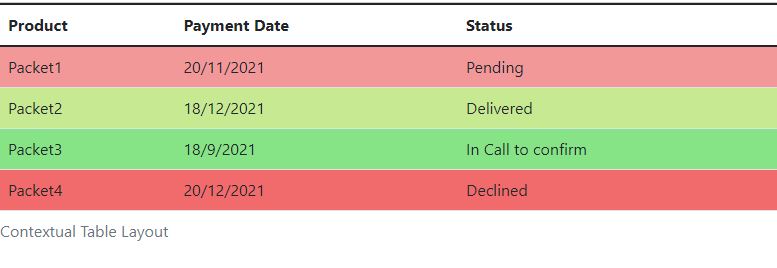
Contextual classes
You can change the background colour of your table rows or individual cells using the contextual classes listed in the table below.
| Sr.No | Class & Description |
|---|
| 1 | .active
The hover colour is applied to a certain row or cell. |
| 2 | .success
This symbol represents a successful or beneficial deed. |
| 3 | .warning
Indicates a possible need for care. |
| 4 | .danger
Indicates a possibly harmful or dangerous behaviour. |
These classes can be applied to < tr >, < td > or < th >.
<table class = "table">
<caption>Contextual Table Layout</caption>
<thead>
<tr>
<th>Product</th>
<th>Payment Date</th>
<th>Status</th>
</tr>
</thead>
<tbody>
<tr class = "active">
<td>Packet1</td>
<td>20/11/2021</td>
<td>Pending</td>
</tr>
<tr class = "success">
<td>Packet2</td>
<td>18/12/2021</td>
<td>Delivered</td>
</tr>
<tr class = "warning">
<td>Packet3</td>
<td>18/9/2021</td>
<td>In Call to confirm</td>
</tr>
<tr class = "danger">
<td>Packet4</td>
<td>20/12/2021</td>
<td>Declined</td>
</tr>
</tbody>
</table>
OUTPUT :
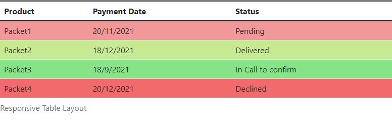
Responsive Tables
You can make any.table scroll horizontally on small devices by wrapping it in the.table-responsive class (under 768px). There is no difference in these tables when viewed on anything larger than 768px wide.
<div class = "table-responsive">
<table class = "table">
<caption>Responsive Table Layout</caption>
<thead>
<tr>
<th>Product</th>
<th>Payment Date</th>
<th>Status</th>
</tr>
</thead>
<tbody>
<tr class = "active">
<td>Packet1</td>
<td>20/11/2021</td>
<td>Pending</td>
</tr>
<tr class = "success">
<td>Packet2</td>
<td>18/12/2021</td>
<td>Delivered</td>
</tr>
<tr class = "warning">
<td>Packet3</td>
<td>18/9/2021</td>
<td>In Call to confirm</td>
</tr>
<tr class = "danger">
<td>Packet4</td>
<td>20/12/2021</td>
<td>Declined</td>
</tr>
</tbody>
</table>
OUTPUT :