inputgroups.html
Input Groups are another feature that Bootstrap provides, as explained in this chapter. Form Controls have been extended to include input groups. You may quickly prepend and append text or buttons to text-based inputs by using input groups.
You can add common aspects to the user's input by adding prepended and appended content to an input field. You can include the dollar sign, the @ symbol for a Twitter account, or anything else that is prevalent in your app's UI.
To add elements to a.form-control, prepend or append them.
Wrap it in a div with the.input-group class.
Place your extra text inside a span> with the class.input-group-addon within that same div> as a next step.
Now, either before or after the input> element, place this span>.
Avoid using select> elements here for cross-browser compatibility, as they can't be properly styled in WebKit browsers. Also, do not use input group classes to create groups. An input group is a separate component from the rest of the system.
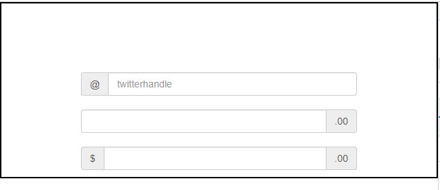
Basic Input Group
The following example demonstrates basic input group −
<div class="container">
<div style = "padding: 100px 100px 10px;">
<form class = "bs-example bs-example-form" role = "form">
<div class = "input-group">
<span class = "input-group-addon">@</span>
<input type = "text" class = "form-control" placeholder = "twitterhandle">
</div>
<br>
<div class = "input-group">
<input type = "text" class = "form-control">
<span class = "input-group-addon">.00</span>
</div>
<br>
<div class = "input-group">
<span class = "input-group-addon">$</span>
<input type = "text" class =" form-control">
<span class = "input-group-addon">.00</span>
</div>
</form>
</div>
</div>
OUTPUT :
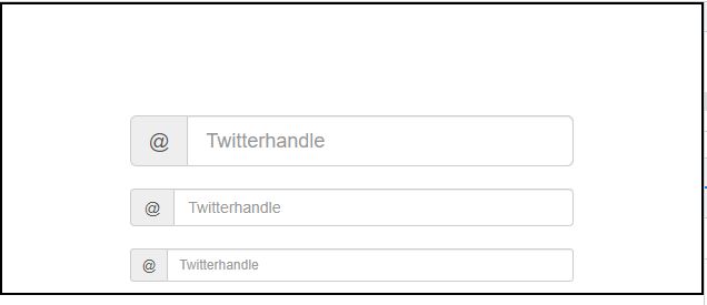
Input Group Sizing
By adding relative form sizing classes like.input-group-lg, input-group-sm, and input-group-xs to the.input-group itself, you can adjust the size of the input groups. The contents within will resize themselves.
This is demonstrated in the following examples:
<div class="container">
<div style = "padding: 100px 100px 10px;">
<form class = "bs-example bs-example-form" role = "form">
<div class = "input-group input-group-lg">
<span class = "input-group-addon">@</span>
<input type = "text" class = "form-control" placeholder = "Twitterhandle">
</div>
<br>
<div class = "input-group">
<span class = "input-group-addon">@</span>
<input type = "text" class = "form-control" placeholder = "Twitterhandle">
</div>
<br>
<div class = "input-group input-group-sm">
<span class = "input-group-addon">@</span>
<input type = "text" class = "form-control" placeholder = "Twitterhandle">
</div>
</form>
</div>
</div>
OUTPUT :
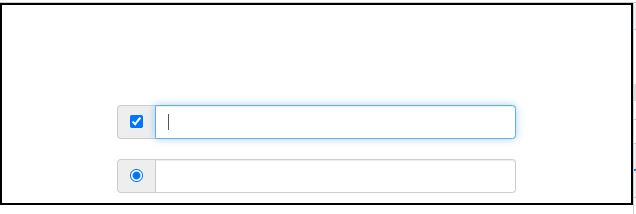
Checkboxes and Radio Addons
Instead of text, you can prepend or append radio buttons and checkboxes, as shown in the example below.
<div class="container">
<div style = "padding: 100px 100px 10px;">
<form class = "bs-example bs-example-form" role = "form">
<div class = "row">
<div class = "col-lg-6">
<div class = "input-group">
<span class = "input-group-addon">
<input type = "checkbox">
</span>
<input type = "text" class = "form-control">
</div><!-- /input-group -->
</div><!-- /.col-lg-6 --><br>
<div class = "col-lg-6">
<div class = "input-group">
<span class = "input-group-addon">
<input type = "radio">
</span>
<input type = "text" class = "form-control">
</div><!-- /input-group -->
</div><!-- /.col-lg-6 -->
</div><!-- /.row -->
</form>
</div>
</div>
OUTPUT :